


Team Relay: find new ideas by bouncing off what the team says
A collective brainstorming technique to develop your ideas together.


A Venn diagram provides a clear way to express the relationships between entities, and particularly where two or more things have overlapping attributes. Venn diagrams simply make data visualization easier, which is why they are commonly used in presentations and reports.
If you need to communicate the relationship between two sets of objects, a Venn diagram is a powerful and efficient way to do so.
At the most fundamental level, a Venn diagram is a pictorial exhibition of all the possible real relations between a collection of varying sets of items. It is made up of several overlapping circles (or sometimes ovals) with each representing a single set or item.
Put more simply, a Venn diagram can be used to show what attributes two sets of objects have, and how they differ. For instance, a simple comparison of the sets of “whales” and “fish” might be drawn like this:

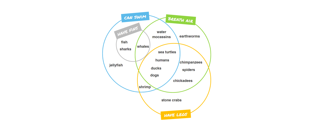
A complex comparison of different creatures uses more circles to represent various attributes:
A Venn diagram serves a fairly straightforward purpose. Like many other types of diagram and illustration, the aim of a Venn diagram is to make information visualization clear and efficient.
Venn diagrams are particularly useful, though, when you need to quickly express how two sets of things relate to each other – the similarities and differences between corporate teams, for instance, or project responsibilities.
Venn diagrams form part of a set of diagrams and illustrations that are very useful in business, projects, and the concept of visual management. They can be used alongside maps of processes as flowcharts to quickly communicate how teams, computer systems, or tasks within a larger project overlap.
In addition, Venn diagrams also have a major advantage over more “complex” chart forms. Since many people are familiar with Venn diagrams from their school days, even non-technical audiences are typically able to read Venn diagrams easily.
A Venn diagram is an illustration that uses circles to show the relationship between two or more groups. Venn diagrams are commonly used in the fields of statistics, probability, mathematics, linguistics, logic, and computer science, and are also invaluable for project management as well.
Venn diagrams were invented way back in 1880, and are named after their inventor, British mathematician and logician John Venn. That year, he published a paper in the Philosophical Magazine and Journal of Science with the title “On the Diagrammatic and Mechanical Representation of Propositions and Reasonings”.
However, the roots of Venn’s diagram go much further back than this. Some have claimed that the first use of the diagrams was in the 1200s, by philosopher and logician Ramon Llull of Majorca. German mathematician Leibnitz also used similar diagrams, as did Swiss mathematician and polymath Leonard Euler. Euler’s diagrams continue to be used, in fact, and even John Venn referred to his own diagrams as Eulerian Circles.
Since the 1880s, Venn diagrams have continued to be used and developed in many fields of pure and applied mathematics.
Venn diagrams have a wide range of use cases, across many different fields. Some of these include:
All this said, the most common use of Venn diagrams is in business. In business contexts, Venn diagrams can be used to compare and contrast products, services, processes or anything that can be depicted in sets.
Not only can this help you to think through a problem, but the Venn diagram itself is also an effective communication tool to illustrate the comparison you are making.
In business, Venn diagrams are particular useful at solving two sets of problems:
Venn diagrams have several uses when it comes to managing or planning projects. As discussed, the primary purpose of a Venn diagram is to show the relationship between two or more sets.
In the case of managing projects, a Venn diagram can therefore be used to compare the different aspects of your project, including:
Venn diagrams have many applications in business as well. They can be used any time that the relationships between things can be seen in terms of sets. And, as mathematicians will tell you, that’s essentially everything.
More specifically, Venn diagrams are typically used in a number of key applications in business:
In order to start designing your Venn diagram, you need to first define what your goals are in creating it. Some datasets and ideas work very well with Venn diagrams, and others don’t. A good rule of thumb here is that if you are using the phrase “in comparison to” a lot, you probably have a set of data that can work well as a Venn diagram.
Second, and as we’ve noted above, there are two main goals for any Venn diagram. Some are made to act as a quick reference guide for decision makers, and can be quite complex. Others are made to quickly communicate complex ideas to staff who may not be familiar with all of the complexities of your project, role, or proposal.
Because of this, you will need to think carefully about the goals of your diagram before moving on to the next step of your diagram.
The next step before you can start using a Venn diagram maker is to brainstorm some ideas for how your diagram will look, and perform the initial data analysis that it will be based on.
With regard to brainstorming, remember that a Venn diagram can be very simple, or very complex. Simple Venn diagrams – those with just two circles, and perhaps three labels – can be effective at making a particular point, but are unlikely to be particularly useful tools in themselves.
However, it can be complex to build diagrams with more than four or five circles: if you find yourself in this position, it’s probably time to break your diagram into a set of illustrations, or re-think your approach.
Second, you may need to perform some data analysis. In general, Venn diagrams do not contain huge amounts of numeric data. However, if you want to make a diagram that compares the key attributes of two audience groups (for example) you could perform analysis to ascertain whether people in a particular audience live in a particular location.
With all of your planning, brainstorming, and data analysis done, it’s time to actually start building your Venn diagram. So long as you have a clear idea of what you want your diagram to look like, and who you want it to communicate to, this is actually the easiest part of producing a Venn diagram.
Then, you can make things even more straightforward by downloading our Venn diagram template.
Core Reasons To Use Klaxoon’s Venn Diagram Template:
It’s important, at this stage, to feel free and experiment. As long as you’ve planned your diagram and data correctly, your diagram should be relatively easy to read in whatever combination of colors, shapes, and graphics you choose. There is no harm getting creative though, and especially so if you are planning on using your diagram in a presentation or report.
Because Venn diagrams are drawn from mathematics, many of the terms that are used in relation to them are mathematical. As such, they can be difficult to understand for those of us who last encountered pure mathematics in high school.
You don’t need to know these terms to create great Venn diagrams, but they can be useful if you are using software to create your diagrams, or need to discuss them with technical staff. Here are some key definitions to help you out:

There are two main reasons for creating a Venn diagram. One is when you need visual help to think through the logical relationships between sets of objects. A second is when you need to communicate the same kind of relationship quickly, easily, efficiently, and beautifully.
Venn diagrams are incredibly flexible, and can be used to communicate a huge variety of different things. In business, they are commonly used for audience, product, or competitor analysis, but any time you are comparing two (or more) sets of objects, you can use a Venn diagram to quickly produce a
The major advantage of Venn diagrams is that they provide a visual way of communicating complex comparisons between datasets. Since many people are familiar with them, they can make your presentations and reports more readable, effective, and persuasive.
Venn diagrams are a powerful, flexible tool for communicating complex ideas. They can be used to elegantly show the relationships between two sets of objects – where they differ, but also where they overlap.
This said, not all Venn diagrams are necessarily effective. It’s important to design your diagram carefully, so it can be read easily. That’s why we’ve produced a number of great template for Venn diagrams, as well as a broader set of project management templates, which can act as great starting points for your exploration of visual communication.
With Templates, innovate in the management of your projects, represent them visually and move forward as a team in a synchronized manner


